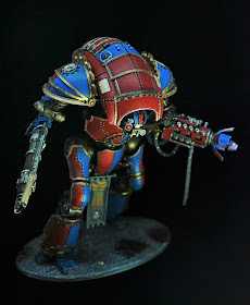
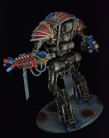
This Knight is from Cypra Mundi Forgeworld, though I don't have a name for it yet (any great idea put it in the comments). The icons are based off the Adepticon logo and are all freehanded, as well as the banner. In fact, the entire model is done by hand. No airbrushing here. Not that I am against airbrushes, I just don't have the set up for it. I did however use some GW airbrush paints with a handbrush, and they are part of why it has a super smooth finish.
The undercarriage was painted with a variety of bronze and silvers, then had weathering powder applied in places, then a generous wash of Argax eartshade. I know that seems backwards, but I didn't want heavy weathering spots, but rather the colours to run and blend, and I think the effect turned out great. After it dried I did some light silver and balthsar gold dry brushing and some nihilikan oxide here and there, particularly on the some places that were more copper/gold still.
Lastly the base is, as mentioned before, done with a textured roller. Sprayed grey, heavy argax wash, then lighter grey dybrushing. I used some clipped brass rod for the spent bolter casings. Finally some blood for the blood god technical was applied and lastly for the oil slick I used some water effects to which I added a mixture of GW washes.
Well enough talk, here are a few more full effect photos!
Oh yeah, I also did do the cockpit. Sorry the photos aren't the best on that. I went ahead an bought the seated Scion model, because I figured if I was spending that much to do a Knight, might as well do it right! Then I painted him first anyway, and the blue on him is what led me to incorporate so much of it in the knight. Originally there was going to be a lot more bone colour, but in the end I decided to downplay that and stick with the strong two tone, working bone in only in the logo and two access panels on the carapace.


